It's nice, but it's not an infographic

Infographics. They’re a visual representation of information or data and have been a top buzz word for the last decade. It’s not hard to see why when you consider that a high quality infographic is 30x more likely to be read than text articles. And given that the brain processes visual information 60,000 times faster than text, they’re becoming a trusty solution for communicating information quickly in a data-saturated world whose inhabitants run out of patience after 140 characters.
They’re also far more memorable. When a relevant image is paired with data, users retain 65% of the information compared to 10% without the graphic. They can be useful – and even beautiful when they’re created right – and they have the ability to take huge amounts of complex data and turn it into something easily understandable.
It seems every savvy marketer with access to the internet and a working understanding of the hashtag is posting their latest “infographic” with the firm belief that with that tag their post is going to be liked and shared 3x more than any other type of content.
But a lot of these so-called infographics lack even the two most basic elements; information and graphics (it’s in the name, guys).
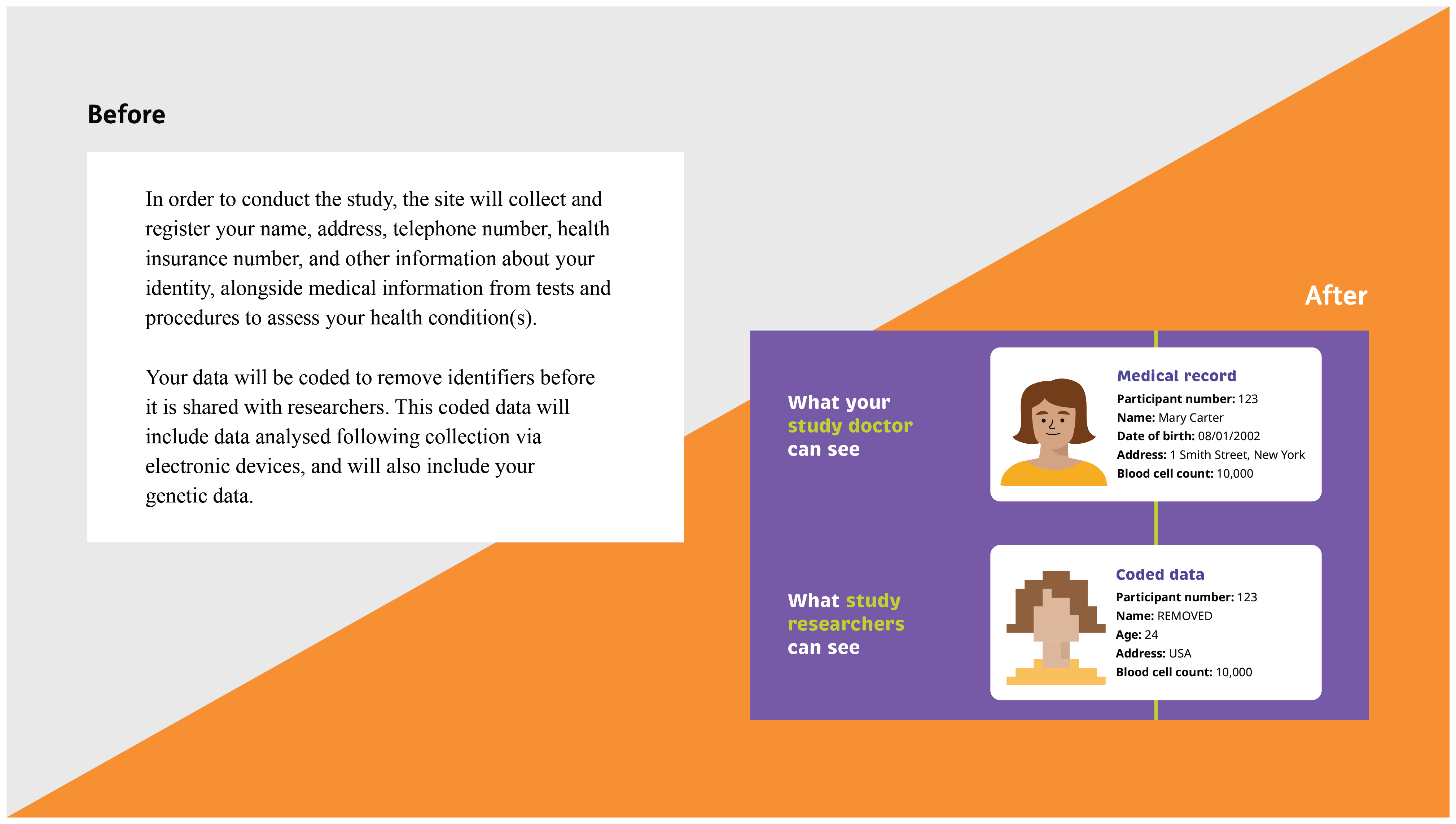
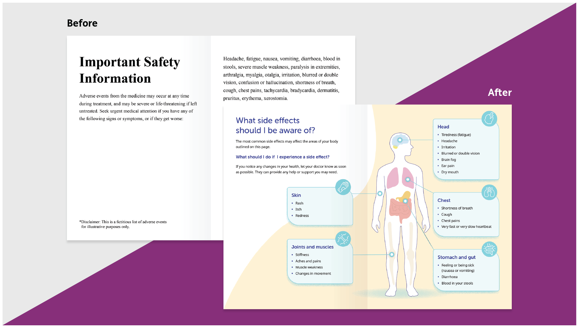
Instead, blocks of text, lists, random facts and the musings of CEOs are being dumped into ‘creative’ shapes, saved as JPEGs, flogged as infographics and, frankly, dilute the integrity of an incredibly useful platform. Infographics should fundamentally make your content easier to understand, not just make it look pretty. So, if you can’t simplify the content then it probably shouldn’t be an infographic in the first place, and for my sake, please stop calling them infographics!
That’s not to say that these pull-out graphics (because I refuse to call them infographics) can’t be effective. Static numbers and bold statements can be successful and fit for purpose. They’ve been used successfully for years in brochures and other print materials to help readers that prefer to skim read; even I use them a lot! But please don’t offend my infographic-loving nature by using ‘infographic’ as a blanket term for anything slightly more visual than Word art or clipart on a PowerPoint slide *suppresses a shiver*.
So, what makes an infographic an infographic?
Google the term and you’ll get a plethora of different opinions on what an infographic is. But as far as I’m concerned, they need context, a useful visual cue or some sort of comparison. Without at least one of those elements they have no real-world meaning and are not an infographic. And by visual I don’t mean a couple of little icons. This seems to be the element that tricks the most people into believing they’ve created the next viral marketing piece, but critically these visuals need to add value and aid your users in better understanding your content – otherwise it’s just visual fluff. Referencing is also important. If you haven’t referenced it, it’s not a true infographic as far as I’m concerned. The last thing you want is your beautifully crafted and researched piece falling into the category of “just because it’s on the internet, doesn’t make it true”. Give your hard work some integrity and intellectual backing – you might even find it makes it past some journalists’ trigger-happy ‘delete email’ button when you do.
Have I created an infographic?
If you want to know if you’ve created an infographic, you can have a go with our flow diagram (which, incidentally, is a type of infographic). Follow the diagram to see if you’ve created one or discover what might be missing from your creation to make it a great infographic. Alternatively, you could use the infographic to work out what you should be asking your design team to create for you: getting the terminology right will lead to clearer briefs and that makes for better results first time around.
Click here to download the PDF


.png)


