From text to context: Helping patients see side effects clearly
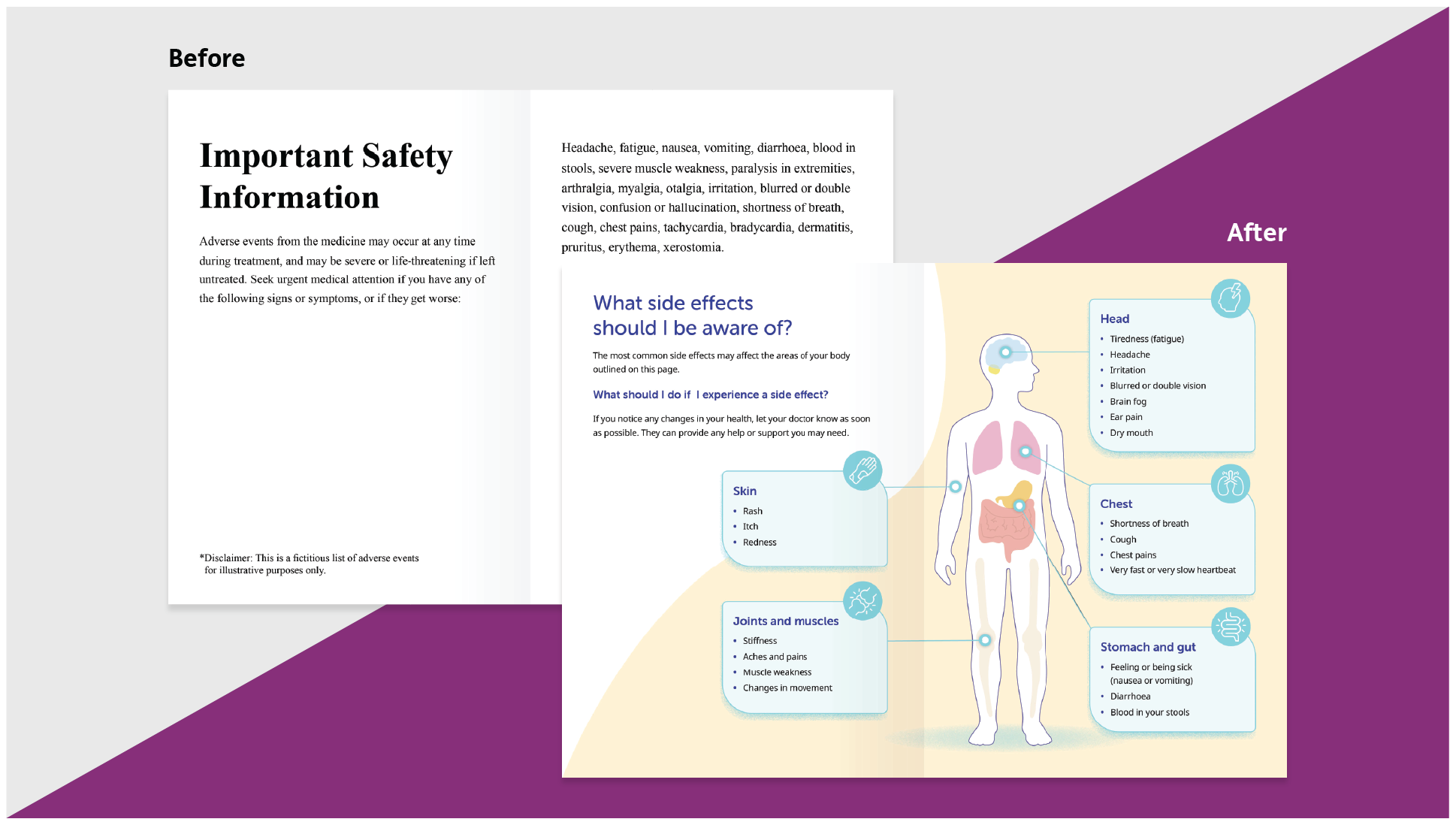
Click and drag the slider below to see a before-and-after example
Our Health Literacy series continues, and this time we're sharing another example of how thoughtful design, structure and language are essential to inform, educate and empower patients — this time in identifying side effects.
If you have read a patient insert for a medicine, or an informed consent form, you will know that side effects lists are often long, confusing, and intimidating. This can make keeping track of what to look out for, and what to do about it, completely overwhelming.
But it doesn’t have to be. For example, our ‘before’ and ‘after’ examples below include the same information, presented in very different ways. And it’s often this that makes the greatest difference to patients: how clearly and accessibly information is communicated.
Before:
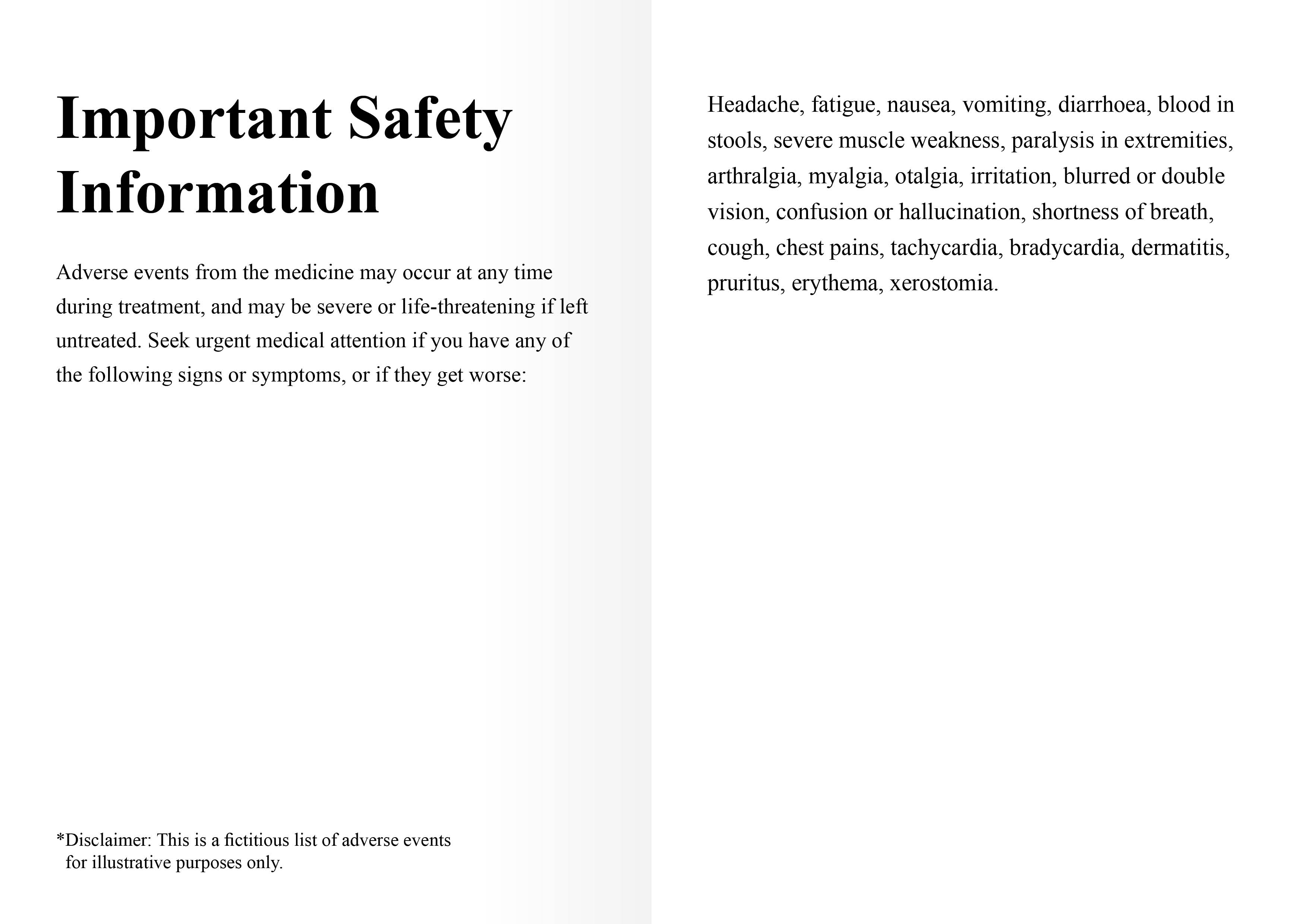
Safety information for patients included a dense, unformatted list of all potential side effects. The descriptions relied heavily on technical terminology, with no context, categories, or cues, making it difficult for readers to take away anything actionable.
After:
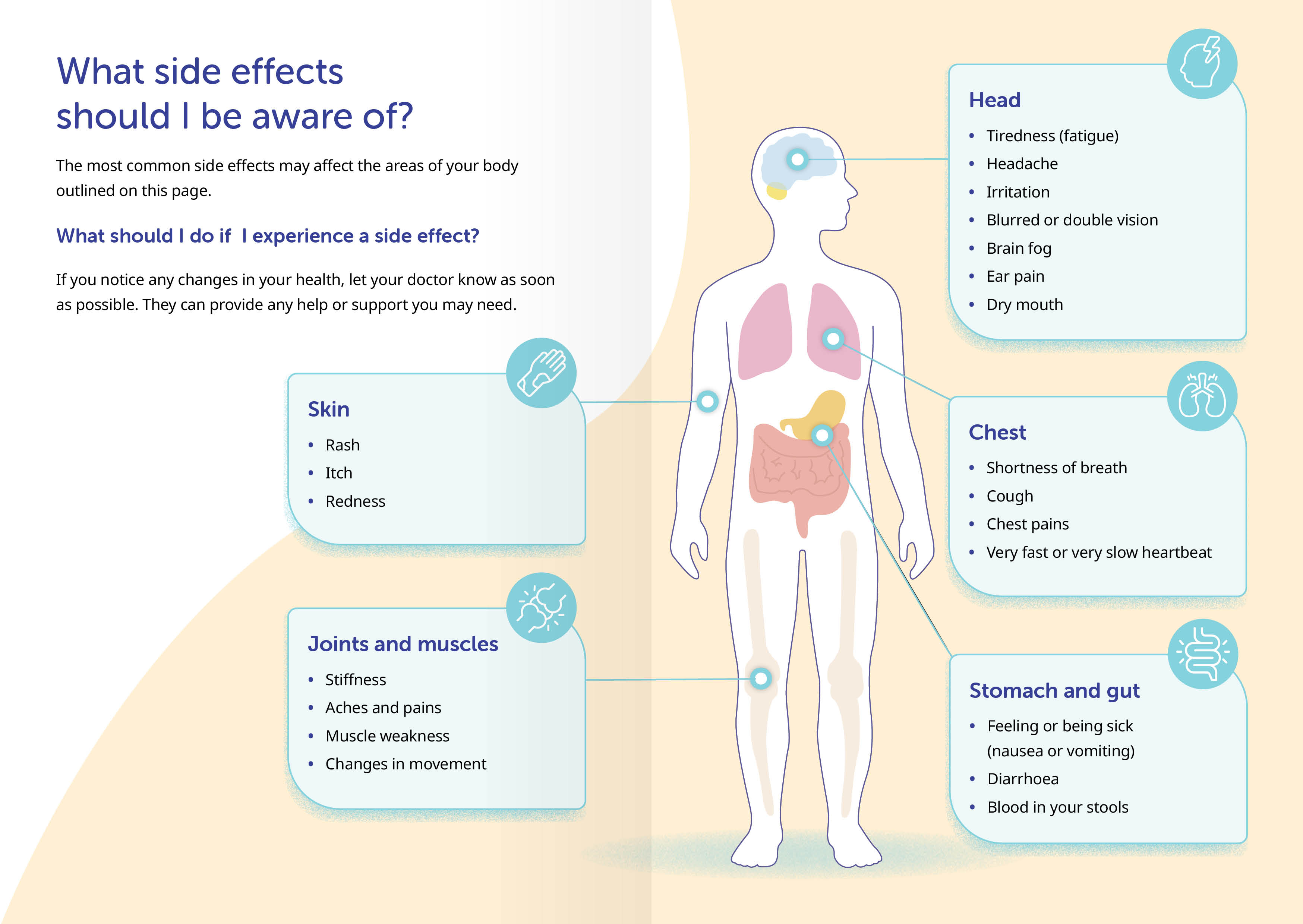
First, we translated all of the technical terms into lay language — “dry mouth” is just easier to process than “xerostomia”.
Next, we grouped everything by body system, so there’s no need to jump around the list for all related side effects.
Finally, we visualised each category on a silhouette, so readers know, at a glance, which body areas might be affected, and which specific changes to look out for.
By combining clear language and intuitive visuals, we’ve made potentially daunting side effect information easier to understand, recognise, and act on.